Kachina_Header_New

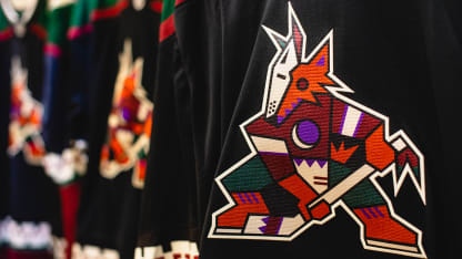
Little known fact: The original Coyotes logo was birthed from a collection of dolls.
The logo, recently voted as the greatest in Valley sports history
by the Arizona Republic
, came courtesy of an idea of Phoenix designer Greg Fisher, who explained the development of his iconic artwork while providing an oral history of the "Kachina" Coyote.
"I've had the opportunity over the years to build a lot of brands, a lot of sports brands," Fisher said. "The Coyotes Kachina we created has its own cult following, and not just in this local market, but with fans across the country."

Colorful and symbolic Kachina artwork is based on the supernatural beings in the beliefs of the Pueblo peoples. A Kachina is not necessarily worshipped as a diety, but rather as an ally and a connection to the forces of nature.
At the time of design, Fisher worked for a Phoenix-based graphic design firm called Campbell-Fisher-Ditko. He has his own company now --
Fisher
-- and still employs many of the people who were on his team when the Kachina Coyote was created.
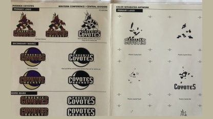
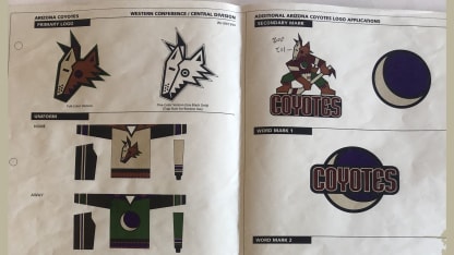
"We started building a brand, color palette, logos, all kinds of stuff for the league and for the first ownership group in 1994, I believe," he said. "But, obviously it wasn't launched until 1996."

KCoyote_Mix1
KCoyotes_Mix2

Fisher worked closely with the organization's first ownership group - Jerry Colangelo, Richard Burke, and Steven Gluckstein -- along with David Haney, the NHL's creative director at the time.
"If you're wondering why the Coyote wasn't an angry animal in the beginning, it's because the NHL was like 'no angry animals'," Fisher said.
"[The NHL's Haney] flew in one day and we were in Colangelo's office with some Kachina dolls, and he said 'Talk to me about the heritage of those,' [motioning toward the dolls]. We built a brand story around that, and it sort of evolved from there."
That moment sparked the process.
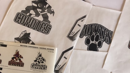
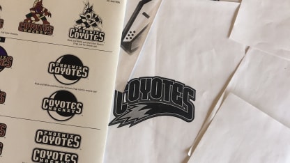
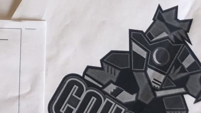
"We probably went down five or six different directions," Fisher explained. "We narrowed those directions down to three, and then we kept trying to simplify the Kachina. Obviously on [a hockey] sweater, it can be a nightmare, there are so many layers and there're so many colors.

KCoyotes_Mix3
KCoyotes_Mix4

"The league would keep coming back to us going 'simplify, simplify, simplify', which we did to the best of our ability."
One of the original Coyote concepts sported sunglasses, Fisher said.

KCoyote_Glasses

"Hockey had never been in the Southwest before, so that was the whole reason for the sunglasses at the beginning - it's so hot and sunny in the desert. … We needed to rely on the heritage of the area, but we still wanted something aggressive and something that was indicative of the area."
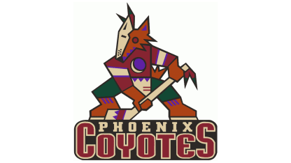
But a constant through it all was the color palette: forest green, brick red, sand, sienna, and purple.
"The colors, with exception of the purple, were drawn from a Native American palette," Fisher said. "[Those colors were] inherent to the area and we were trying to build regional patterns, motifs, stuff like that."
Fisher and his team of designers built several subtleties into the logo - the black base on which the Coyote skates; the overarching shape of the Coyote itself and, of course, the crescent moon.
"Most people don't realize that the Coyote is standing on a puck that's flat down and that the overarching shape of the Coyote is an 'A' for Arizona, even though at the time [the team] was the Phoenix Coyotes."
"That crescent moon obviously creates a 'C' for Coyotes'," he said.

KCoyotes_Primary

The team designated the purple moon as an alternate logo and shoulder patch.
"It actually started out as a primary with one of the directions we were going down," Fisher said. "We went down several paths with pucks and paws and lots of different things."
A few years later, Fisher
designed the crest
for the first alternate jersey in team history - the green, desert-scape uniforms, unveiled in 1998. "The league came back to us and had us build the Coyotes mask, for that mask jersey," he said. "Just the mask, not the jersey."
And the oft-forgotten
salamander shoulder patch
also became part of the team design.

KCoyote_Salamander

"That's what that salamander came for, it was originally a jersey detail, it wasn't supposed to be a logo," Fisher said. "It was never meant to be a logo. You know the bands around the bottom of the Kachina jerseys and the band around the neck? That's what the salamanders were originally built for - we were trying to get that desert lizard in there. It never happened. But it was also never meant to be a primary or secondary logo."
No one knows more about Coyotes uniforms, perhaps, than Stan Wilson, head equipment manager since 1990. And Wilson didn't hesitate when asked about the most popular jersey among the players.
"Oh, for sure, without question it's the Kachina now," Wilson said. "Back when we originally wore it, the design of it, the actual material was tough. It absorbed so much water, so it was so heavy, the originals that we wore back in the 90s. The new ones now, they're all built with the new technology so they're so much better. The guys love them, the players … they would wear it all of the time if they could."

KCoyotes_1996

Said Fisher: "[The logo] has a life of its own and that's phenomenal. The Kachina has gone from probably one of the most difficult logos the league has ever tried to produce, to probably one of the most enduring logos - and even the NHL will tell you that.
"Of all the brands we've built -- I love it. But it's just crazy. It's unbelievable."
Fisher and Haney recalled seeking and getting the approval of Hopi leaders in Arizona before the final Kachina-style logo was made public.
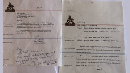
Fans first got a peek at the original logo in April of 1996, just six months before the team played its first official game as the Phoenix Coyotes after a move from Winnipeg.
"Everybody was really excited, and honestly, it was well received," Fisher remembered. "But everyone expected a howling Coyote at the moon, and that's not what we delivered."
Instead, he delivered the greatest logo in Arizona sports history.

KCoyotes_Letters

Logo Blueprints, Documents, Coyotes Letter Credit: Greg Fisher - Owner, Fisher Phoenix // Lead Photo Credit: Kevin Anggara - Arizona Coyotes // 1996 Primary Logo Credit: Sportslogos.net // Alternate Green Jersey Photo Credit: Brian Bahr - ALLSPORT via Getty Images // Inaugural Season Jersey Photo (Roenick) Credit: Nevin Reid - ALLSPORT via Getty Images