SMKT-4179_BHC - Article Header for Crest Reveal_1920x1080

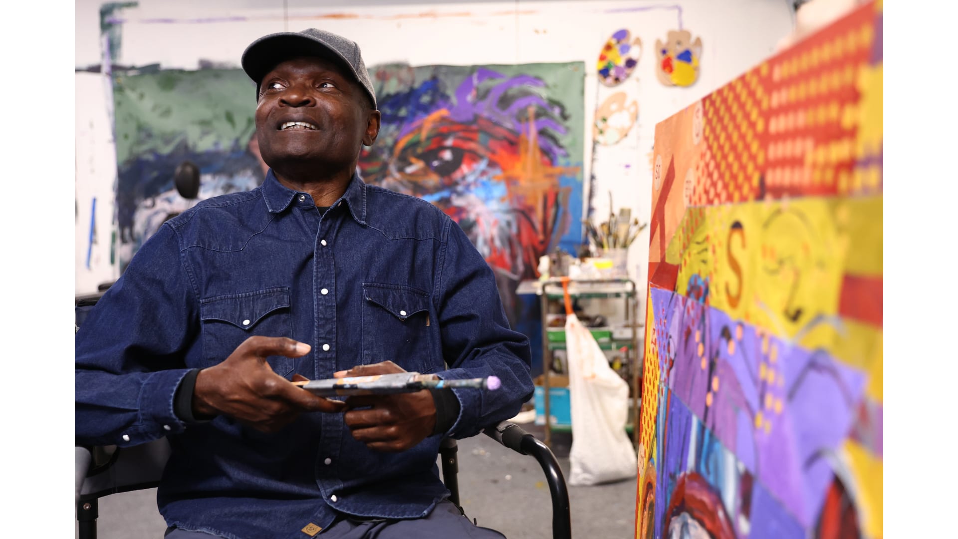
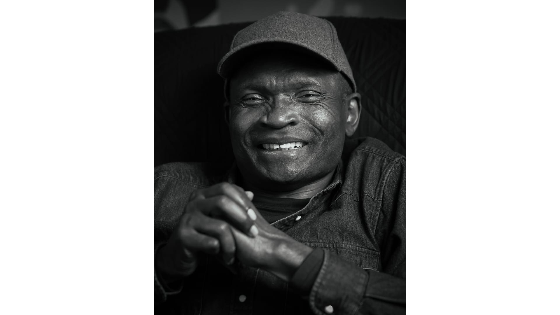
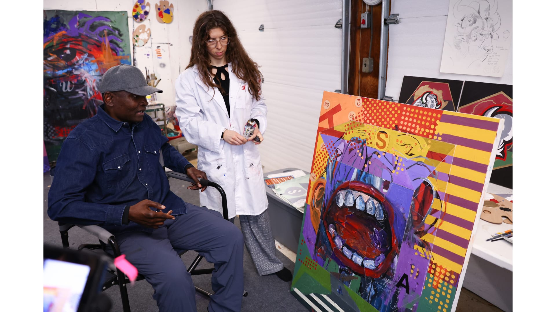
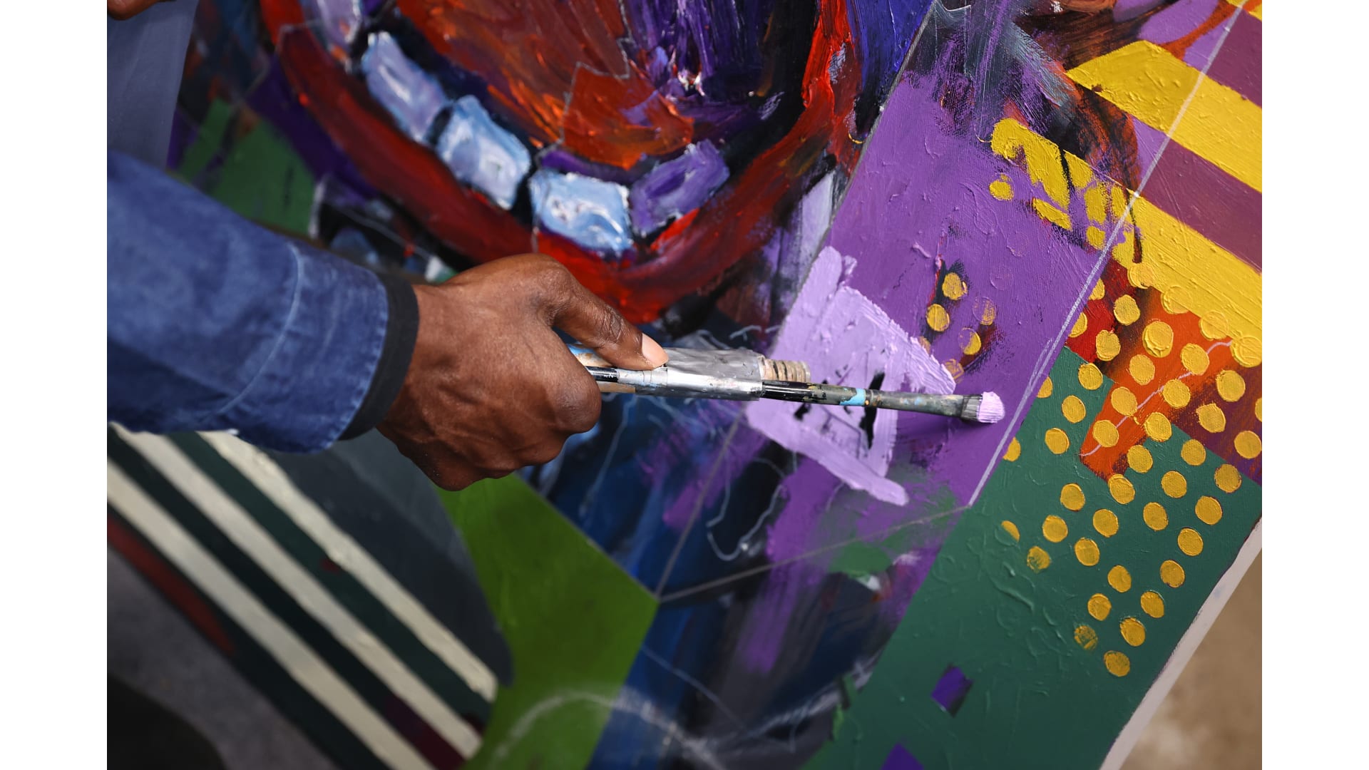
George Afedzi Hughes typically begins his paintings from a place of chaos.

Rather than working on a blank white canvas, Hughes will start a painting by abstractly adding colors on top of one another, then slowly give them shape and meaning. Other times, he’ll take a physical object – a tossed away architectural blueprint, for example – and give it new life as the foundation for one of his works.

“I would say figurative abstraction,” Hughes said of his style. “There is always some hint at a particular subject or content, but I give it some kind of a poetic twist.”

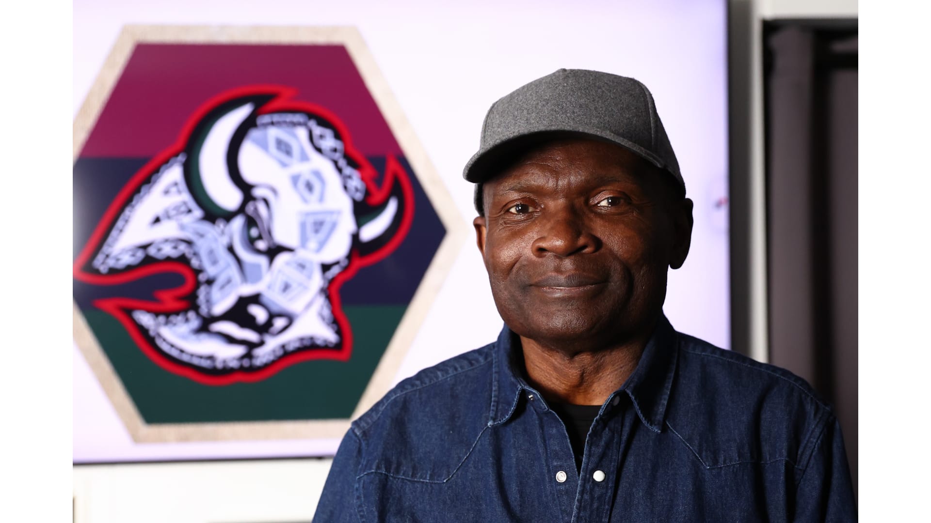
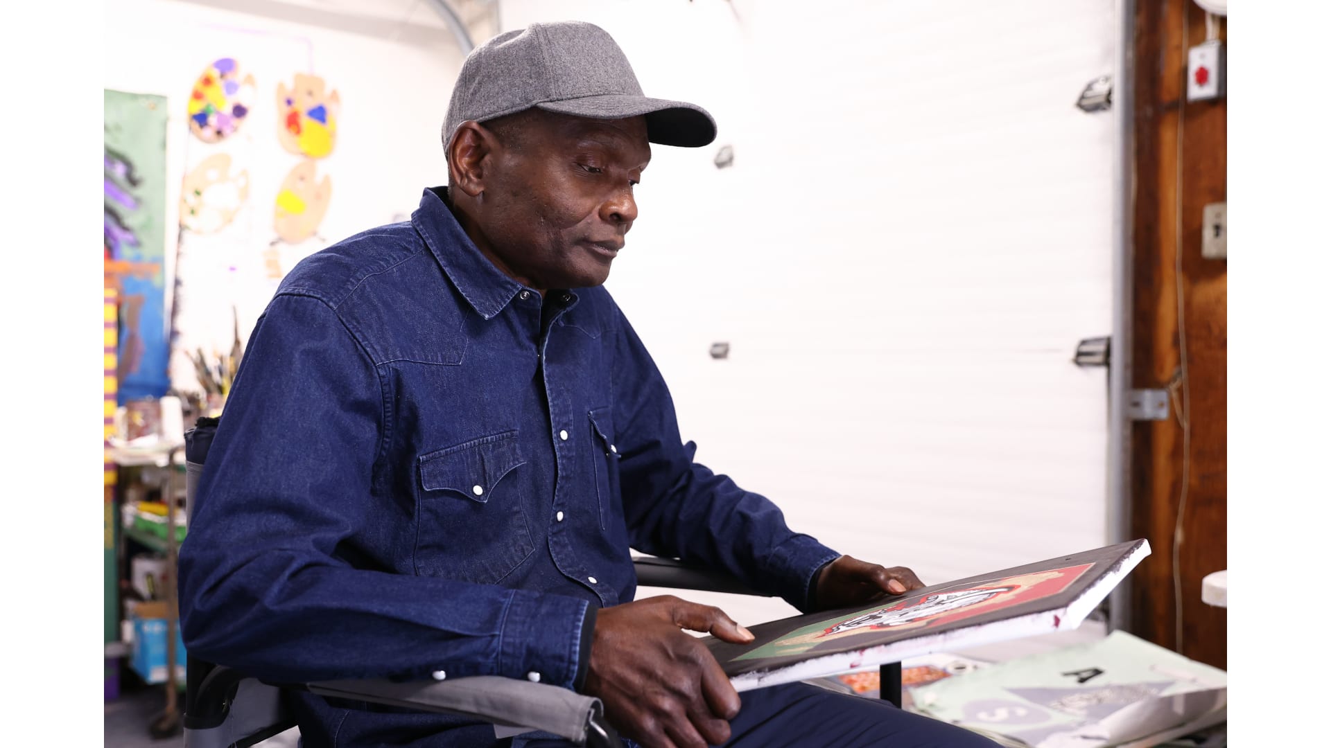
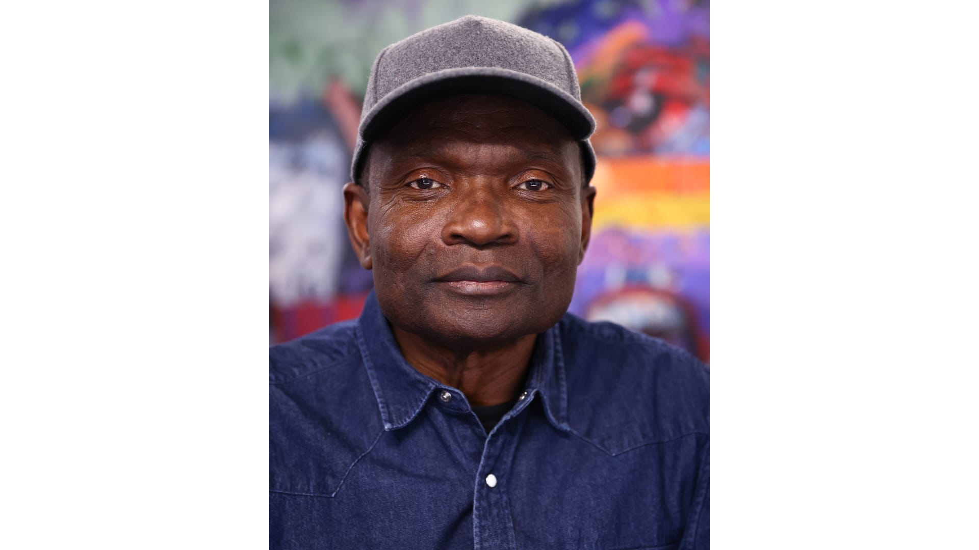
Hughes – a native of Ghana who now heads the painting department at the University at Buffalo – offered his take on the Buffalo Sabres logo as the third Community Artist Series design in collaboration with Buffalo AKG Art Museum.

While the first two Community Artist Series designs were based on the Sabres’ primary crest, Hughes is the first to create a design based on the “goathead” throwback logo.

His design will be printed onto a set of practice jerseys which will be on display in the KeyBank Center concourse and put up for auction during the Sabres’ Black History Celebration game against Los Angeles on Thursday, Jan. 29.

The auction begins at 2 p.m. on Jan. 29 and closes at 9 p.m. on Feb. 8. All proceeds benefit the Buffalo Center for Arts and Technology, which offers free adult workforce training and youth afterschool programs in the Buffalo area.

Design Details

The Sabres logo served as a more refined starting point than Hughes’ usual abstract palette, but one core essence of his work – the idea of giving new meaning to an existing piece – very much remained.

Hughes studied the logo and offered various takes before arriving on his final, hand-painted design. He carefully placed Adinkra symbols – native to the Akan people of Ghana – throughout the logo, each containing their own meaning: the interlocked diamonds for justice and law; the black diamond for beauty and strength; the comb for grooming; and another diamond-shaped pattern symbolizing strategic work.

The logo is encased by a hexagon, which Hughes describes as an efficient structure symbolizing interconnectedness, balance and harmony. It’s gold color is a nod to the natural resources that Africa has contributed throughout the world.

In the background sits the red, black and green Pan-African flag. And, atop the head of the Buffalo, the gray arrows are intentionally divided but pointed toward the same direction.

“Even though the gray arrow is fractured, the peaks of the diamonds are pointing toward one another, showing that there's still continuity through blood, through lineage, through heritage,” Hughes said.

Hughes hopes that by adorning these designs – the Adinkra symbols, the Pan-African colors – on top of the Sabres logo, it will spark curiosity as to their origins and meanings.

“I want the work to impact [people] aesthetically, for them to see some sort of artistry in the design, even though the predominant structure of it is the same as the logo,” he said. “I want the designs on top of the Sabres logo to bring them some kind of a hint of the African heritage.”