MONTREAL -- To these eyes, there are no ugly Original Six NHL jerseys.
Well, apart from that barber pole catastrophe the Montreal Canadiens wore during their 2008-09 centennial season.
What the Toronto Maple Leafs will wear during the 2016-17 season, marking their 100th anniversary, will further beautify the NHL uniform landscape.
To many in Montreal it is heresy that I would even mention the beautiful new Maple Leafs logo unveiled Tuesday.
Maple Leafs dressing up for 100th anniversary
Toronto's new logo first step to on-ice success

Heaven help me when I wax poetic on Twitter about the gorgeous New York Rangers road white, my favorite NHL jersey of all. Or the historically magnificent sweaters of the Chicago Blackhawks -- Black Hawks, when it was two words -- and Detroit Red Wings.
Even the hub crest of the Boston Bruins, preceded by the team's prowling bear, is special to me, never more than when it was when worn by the team's legends of yesterday.
Full disclosure: This typist was born in Montreal 10 years before the NHL expanded from six to 12 teams, drawing my first breath smack dab in the middle of the Canadiens' historic 1956-60 run of five consecutive Stanley Cup championships.
I was raised in this city and have spent my entire life here, save the seven-plus years I worked in Ottawa, worshipping the Canadiens of the late 1960s and a fan through the 1970s. As a boy I wore many Canadiens jerseys, from the hardware store's ironed-on CH crest versions to the heavy wool number that smelled, after an outdoor game of road hockey, like a wet dog.
Maple Leafs reveal new logo
(A friend in Ottawa, then a diehard Maple Leafs fan, remains traumatized by a mid-1980s Santa Claus parade -- it might have been 1986, a few months after the Canadiens' 23rd Stanley Cup victory -- during which he tried to shield his young sons' eyes when Santa arrived on Bank Street wearing a Canadiens jersey. But I digress.)
The long-ago Canadiens-Maple Leafs rivalry in Montreal, once as pleasant as a sip of sulphuric acid, is sweeter today than the bitter cocktail of a Canadiens-Bruins game.
But the Maple Leafs still hold a special place of disdain in the hearts of many Canadiens fans.
On Tuesday, following their 4-3 overtime win against the Bruins, the Maple Leafs unveiled their new logo. And -- ducking here in Montreal -- I think it's lovely.
In full agreement is the legendary Johnny Bower, the 91-year-old Hockey Hall of Fame goaltender who wore two or three different Maple Leaf crests while winning the Stanley Cup four times between 1958 and 1969.
Is the iconic Bower one of a kind?
He's not just the oldest living goaltender to win a Stanley Cup for Toronto; he's the only living goaltender to do so.
"This logo is classier-looking than what the team is wearing today," Bower said from his Toronto-area home Wednesday, not yet having seriously studied the new look that will make its debut at the 2016 NHL Draft and will be worn full-time next season.
"But today's crest is OK, too," he quickly added, unable to say a bad word about his team.
Bower believes he has just one Maple Leafs jersey at home, having given to charity more than he can count. But you'd best believe he'll soon have another one in his collection, his team surely preparing one for their living legend and one of the greatest gentlemen in the game.
NHL jerseys are big business, of course. Third jerseys and special editions for outdoor games are hugely popular with fans.
It has been 46 years since the Maple Leafs more than cosmetically touched their logo. Off limits, naturally, was the nickname, the grammatically incorrect "Leafs" having been chosen by team founder and fiercely patriotic Conn Smythe when he rebranded the Toronto St. Patricks in 1927.
There's now a plan afoot to rebuild the Maple Leafs to at least within a shadow of its former glory, a veteran management team and coach Mike Babcock in this for the long haul.
It won't go unnoticed that the Maple Leafs' centennial will coincide with the 50-year anniversary of its most recent Stanley Cup victory, an implausible upset of the Canadiens in Canada's centennial year.
(Boy did the Maple Leafs spoil the Canadiens' fun that year. Montreal crowed that it would display hockey's holy grail at the Quebec pavilion at the Expo 67 world's fair. It appeared instead in the Ontario pavilion, Montreal natives figuratively holding their nose when they saw it.)
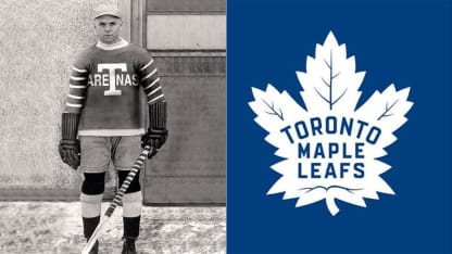
The new Maple Leafs logo leans heavily on the team's celebrated past. And there's symbolism aplenty, the club saying the new look draws inspiration from the crest worn between 1938 and 1967:
* The 31-point leaf reflects the Maple Leafs' 1931 Stanley Cup victory and the opening that year of famed Maple Leaf Gardens.
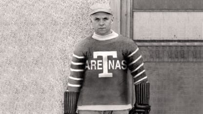
* The 17 veins on the leaf remind of the franchise birth in 1917-18, first as a club with no nickname, then the Toronto Arenas and then the St. Patricks before the Maple Leafs came into being.

* The 13 veins on the leaf's top half, above lettering that has been modernized and tidied, celebrate the 13 times the Maple Leafs have won the Stanley Cup.
On Wednesday, still sorting through what he said mostly is positive feedback to the new look, Maple Leafs president Brendan Shanahan said the logo is "just a piece" of what this storied franchise is working to do.
Messing with history and tradition often is playing with fire. But good on the Maple Leafs for respecting both, blueprinting their future while borrowing from their storied past.
Now comes the hard part: Writing a few good chapters on the ice.
For Johnny Bower, the blue blood of this team still thick in his heart, the jagged points of the Maple Leafs logo remain a sharp reminder of his own glorious past.
"I owe my crests a lot," he said with a laugh. "They used to stop a lot of pucks for me."


