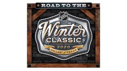
The NHL's Creative Services Department, a staff of nine, knew it wanted some sort of cowboy motif to celebrate the game being in Dallas and at Cotton Bowl Stadium.
Would it be derived from the sheriff's badge, an iconic symbol of the Texas Ranger Division, or perhaps something that riffed off the stitching associated with cowboy boots and horse saddles?
In the end, it was the belt buckle, an oversized sartorial ornament favored by cowboys, that won the day.
"The shape just felt big and iconic" Conway said. "The silver aspect of the belt matched up with the silver qualities of our shield. It just starts to click. Then we started laying in the Winter Classic typography and stylizing the font and that is when it really came full circle. So it was it was a cool process."
The design department felt so strongly about the design that they were going to get replicas made after it cleared the approval process.
That a-ha moment was the culmination of more than 400 hours of development by the creative services department and, once approved, was the jumping-off point to hundreds of hours in the implementation process.
Once the logo is finalized, NHL Creative Services develops a brand style guide and an asset package guide that is distributed to League's various departments and external stakeholders, including sponsors and rightsholders. Eventually it works its way into other mediums, including event signage across the city, key cards at various hotels and directional signage across the state fairgrounds footprint.
"It's to create awareness and brand exposure for the event," said Greg Mueller, design director for the creative services department. "It amplifies the message and the notoriety around the event to give it a little more equity as well. It allows us to control the brand and allows everything to come from the same visual voice."
And it allows Conway, Mueller and the rest of the creative services department to relive their breakthrough moment everywhere they look.


