"Who in their right mind is pitching 'let's have a giant cheesesteak face off against a piece of pizza?'" Anthony Zych said to himself before subsequently presenting the idea to the New York Islanders.
Admittedly, Zych was building off a riff of how to pit New York and Philadelphia against each other when ideating the first design of his Islanders poster series. He had started with early visions of building a historical poster around Bobby Nystrom's Stanley Cup-clinching goal in 1980, but when thinking about the cultural touchstones between the cities, he settled on food instead.
Inside the Islanders Poster Series
Get a behind-the-scenes look at the Islanders poster series by artist Anthony Zych
By
Cory Wright
NewYorkIslanders.com
"I like to draw more from the cultural parts in each city because the fans are really what make a team, a team," Zych said. "The food wars between the cities, with cheesesteaks being so popular, that's culturally relevant to Philadelphians, and pizza is one of those broader New York foods. That was a good opportunity to use fans as an inspirational moment there."
There were a few iterations of the poster starting with an OT winner and arriving at a flavor-filled faceoff. One version included fans throwing bagels and pizza on the ice during Nystrom's OT winner. Pizza became a focal point and then the food battle was on.
"I wanted to do something fun, a pizza fighting a cheesesteak," Zych said. "I actually viewed it from the perspective of Muhammad Ali, the iconic photo of him pounding his chest over Sonny Liston. It was a pizza standing over a cheesesteak - that was the jumping off point."
𝐍𝐞𝐰 𝐘𝐨𝐫𝐤 𝐯𝐬. 𝐏𝐡𝐢𝐥𝐚𝐝𝐞𝐥𝐩𝐡𝐢𝐚
— New York Islanders (@NYIslanders) January 30, 2021
We teamed up with @AnthonyZych to create these limited-edition posters highlighting this weekend's matchup with the Flyers! 😍
Tonight on MSG+ at 7PM. pic.twitter.com/OtQ7bYoxvP
The end result was a vibrant, unusual, and engaging digital print - a unique stamp on a rivalry with 273 chapters already written. That's just what Zych, an illustrator from Ohio now living in New York, does, combining his artistic skill with his love of sports. The genesis for the posters started when he was a graphic designer with the Columbus Blue Jackets, looking to shake things up as opposed to running back the same graphic templates for 82 games a season.
"We wanted to give fans something different to look at," Zych said. "Different playbill sort of style posters for every game."
He's done work for NHL teams, NFL teams, Bleacher Report and Showtime Boxing, among others. This season, he's working on a matchup poster for each of the Islanders' seven divisional opponents - a unique flair on a unique season.
The process to make each poster takes about 20-25 hours from the time the first notes are jotted down until the last colorful stroke is made. Zych has an in-depth process, learning as much as he can about a team's history, fan traditions, cult figures and more, so he can craft the right tone and add Easter eggs for keen observers.
Once he has a concept, like say, cheesesteak vs pizza, he'll produce two to three line drawings, using his iPad for 90-95% of the process. As an illustrator, he has a few different styles - a digital painting approach or a comic book type feel. He likes dark ink and vibrant colors, using sunsets and skies to create a mood, which is evident in the Isles vs Flyers poster.
Trying something new today... #TimelapseTuesday
— Anthony Zych (@anthonyzych) February 16, 2021
Making an effort to be more open about sharing my process in my work. A little nerve-wracking to screen record everything (missed some parts early on and late) start to end.
👀 this 85% complete timelapse of my last #Isles poster pic.twitter.com/uR587CFe8T
"It's very important to me the visual story that I tell, through sizes, scale, color use, everything that goes in here," Zych said. "I think a lot of people may just see that I colored this poster and it's weird and it's funny, but every digital pen stroke, there's a reason it's going there."
One of the fun parts of the process is adding the Easter eggs. With a city vs city rivalry guiding the Isles vs Flyers poster, the background provided a chance to insert famous landmarks. On the Islanders' side, he included the Montauk lighthouse, UBS Arena and the Empire State Building, iconic symbols for metro New York. This New York skyline was matched up with Philadelphia's city hall, the Liberty Bell, and the Rocky statue.
Of course, if Philly is going to get a pop culture icon like Rocky, Zych wants to even it out on the other side, which is how King Kong wound up back on the Empire State Building, hockey stick in hand.
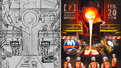
But every poster presents a blank canvas for new concepts, new designs and new Easter eggs. For Zych's second poster against the Penguins, he was trying to find ways to incorporate the industrious character of Steeltown, but give it an Islanders flavor. A characteristic of Zych's work is to have teams take over the motif of the opposition.
My second game day poster with the #Isles drops tomorrow as they face off against my childhood favorite team, #LetsGoPens
— Anthony Zych (@anthonyzych) February 20, 2021
Here is a little behind-the-scenes action of Billy Smith getting into metallurgy 👀#ProCreate #smsports #nhl #HockeyTwitter #HockeyJerseyDay #HWAA pic.twitter.com/rpodIsVA98
If steel mills are part of Pittsburgh lore, why not set the scene in a foundry used to produce the beams for UBS Arena? Look closely in the background and you will spot the final steel beam that was placed during the UBS Arena topping out ceremony in October, 2020.
"The overabundance of orange, the molten hot steel, I thought it was a nice way to make this feel like the Islanders owned the steel factory," Zych said. "Casting all these steel beams, casting the Yes! Yes! Yes! mold, the UBS Arena beam, it just seemed like the best option."
"I knew the colors would work perfectly" Zych added. "It was great to have something where I didn't have to think, oh I need to fit the Penguins in somehow, it was just the essence of Pittsburgh."
That's just a starting point. The workers in the Pittsburgh poster were all intentional. Ray Ferraro and David Volek to celebrate the Islanders 1993 playoff series upset over the Penguins. John Tonelli saved the dynasty with two goals in a Game 5 rally vs the Pens in 1982. Trevor Gillies, with his gloves strewn on the factory floor, is representative of the infamous Fight Night in 2011, the brawl-filled game where the Islanders re-ignited an old rivalry.
Speaking of igniting, Zych used Sparky the Dragon breathing fire to heat up the molten steel being poured into the metal casts. Sparky played into a few early iterations of the Penguins poster, including one where he and Iceburgh - the Penguins mascot - topped off UBS Arena and another with Sparky in welder's goggles pouring steel into skate blades. Look closely and you will see a different take on the welder's goggles, with Billy Smith's iconic fiberglass hockey mask doubling as a heat shield - Zych's favorite Easter egg.
"Fans were explaining it to other fans and I thought that was the best part of it," he said. "You get that communication piece and fans interacting with each other and engaging with each other and the poster."
Engagement and Easter eggs were the guiding light for Zych's third poster, ahead of the Islanders vs Sabres game on March 6. With the Islanders dedicating that week to celebrating Isles Nation, a global fan community with over 35 supporter groups around the world, Zych envisioned ways to bring all of the Isles fans together from Belmont to Brazil.
Look closely 🔎👀 pic.twitter.com/Q2iqP0Aj1C
— New York Islanders (@NYIslanders) March 6, 2021
During a back-and-forth with the team, the idea of a Where's Waldo style poster came up, inspired by the music-festival themed poster featuring Daft Punk that circulated in 2016. It was the perfect concept in more ways than one. An Islanders tailgate seemed like a fitting background to bring together the Islanders global fan base, and the style of the poster lent itself to including all different types of Easter eggs for fans to enjoy.
"That's also the global language," Zych said. "You don't put words on there, but everybody can still look and see the players that they recognize and the iconic locations throughout the Islanders fanbase."
Zych said there are about 58 nods to Islanders lore sprinkled throughout the 200 or so characters. Sparky the Dragon and Nyisles - the team's short-lived fisherman-themed mascot of the 90's - are in the top right corner, bullfighting with the Sabres' mid-2000s buffalo logo. Billy Smith on a beach chair and Mike Bossy's flaming stick are two nods to the past, while the lobsters, which the team Twitter account tweets after every win, are doing lobster things in the bottom right.
There's so much more, from MSG broadcasters, to a Blue Line Deli bagel lifting one of the four Stanley Cups hidden throughout. To honor the international fans, Zych added supporter flags from the various fan groups.
If it seems like a big task to include all of these references, Zych begs to differ, that's the fun part.
"They gave me everything and a full runway to play with," Zych said. "It was like, 'try and get most of these in.' For Where's Waldo, I said 'I'm going to get them all in.'"
If anything, the intensive part is filling in the background with the extras, fans on their phones, or parents wrangling kids. He has an artist's mannequin that he can easily change into different shapes to have a reference for different perspectives - an artists hack. He also channeled his inner Alfred Hitchcock, putting himself, his long-term girlfriend and their dog in the poster. It's his favorite Easter egg in this poster, followed by the scene at Niagara Falls in the top left corner, where a fisherman is sitting in a barrel - a local nod to Niagara lore - reeling in a Stanley Cup.
Didn't record a timelapse on this one, but here's a peek behind the curtains at how I approached drawing each character in this #Isles poster.
— Anthony Zych (@anthonyzych) March 7, 2021
Anything not on this sheet was made on the fly within the poster like Niagara Falls bg, MSGN stage, and the Mountauk lighthouse slide https://t.co/tplAI1Fsqd pic.twitter.com/szK1EyEPB3
Niagara Falls is also one of the nods to Buffalo in the illustration. It is supposed to be a matchup graphic, so Western New York needed a little representation. Enter Bills Mafia, Scott Norwood and Rick Jeanneret, and a reason for Sabres fans to parse through the graphic as well. At the end of the day, Zych wants his illustrations to be accessible to as many people as possible and hopefully bring some new fans to the team.
"Unless the goal is to be a one-sided poster, I like my matchup illustrations to be something that can get everybody together, rather than one fanbase vs the other," Zych said. "The fact that it was a gigantic tailgate scene made it perfect not only to your visiting fanbase, but also New Yorkers as well."
Zych is already working on concepts for future posters and is excited to see the next one launch. From concept to illustration style, the artist has only shown part of his range and is excited to do more. The Islanders poster series isn't even halfway complete, but in a way, it's already come full circle.
Take a look in the left-hand corner of the Isles-Sabres poster and you will see a Buffalo wing facing off against a slice of pizza, this time with a black and white cookie dropping the puck. It's a nod to Isles-Flyers and a new, self-contained world Zych has illustrated.
Right mind or not, who else is out there pitching that?


