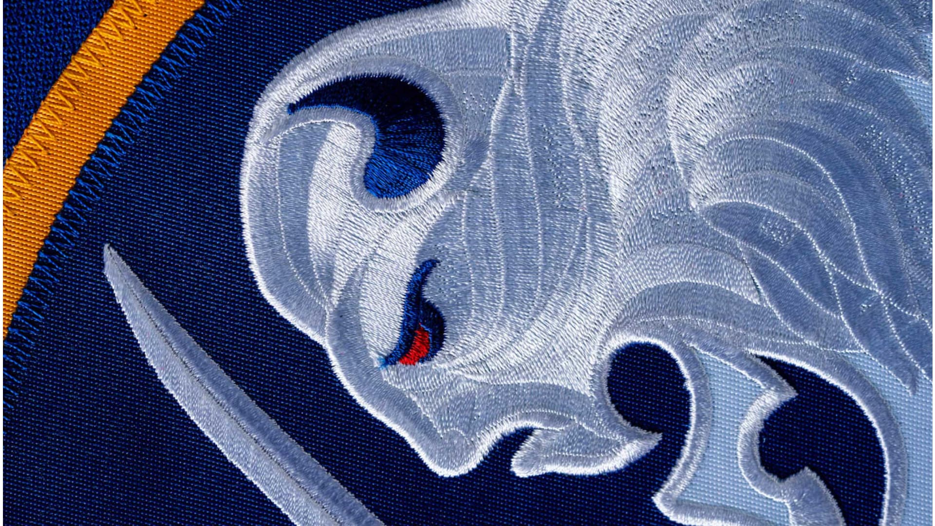
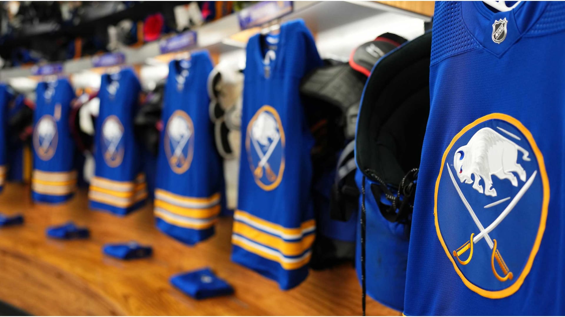
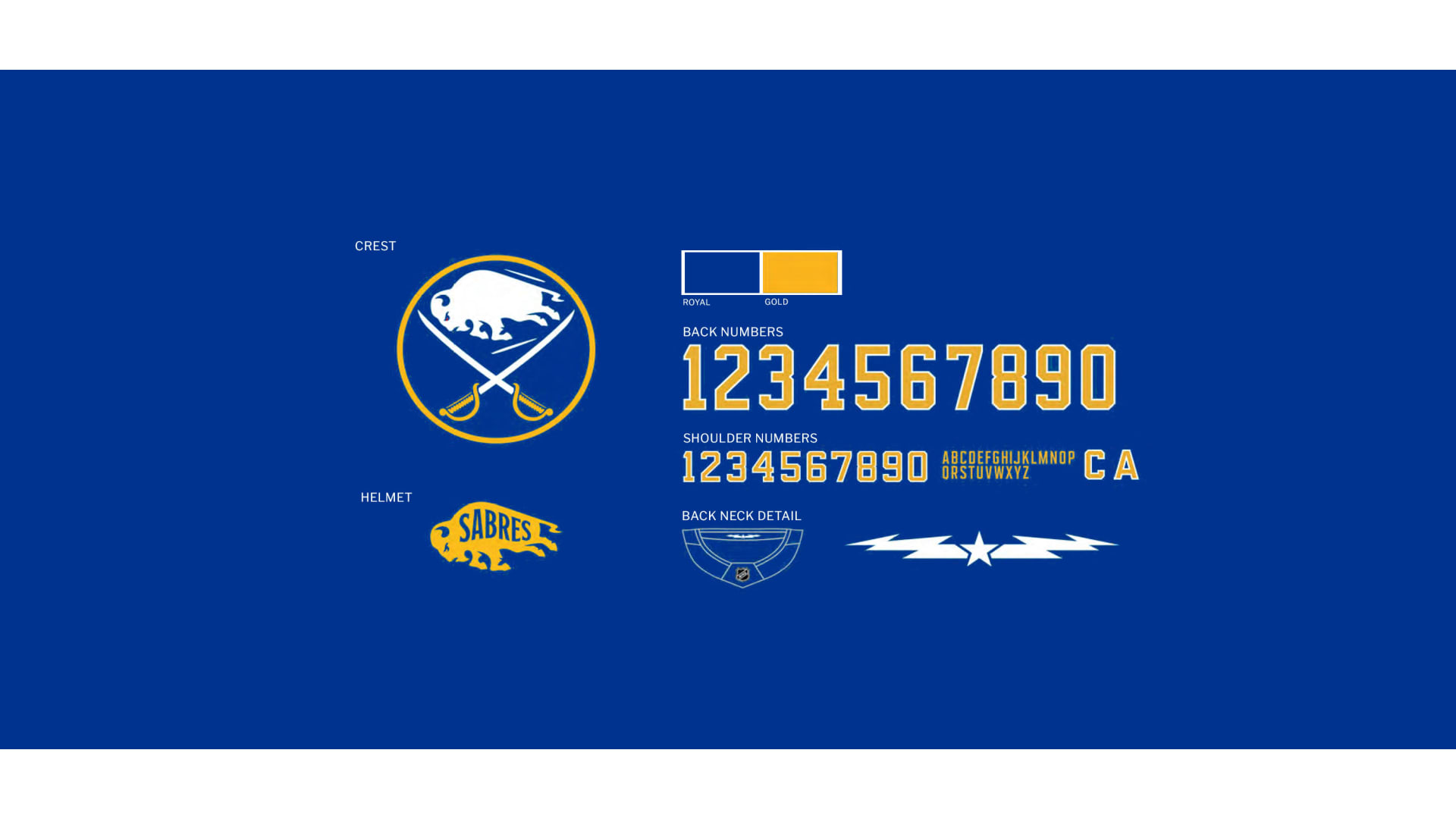
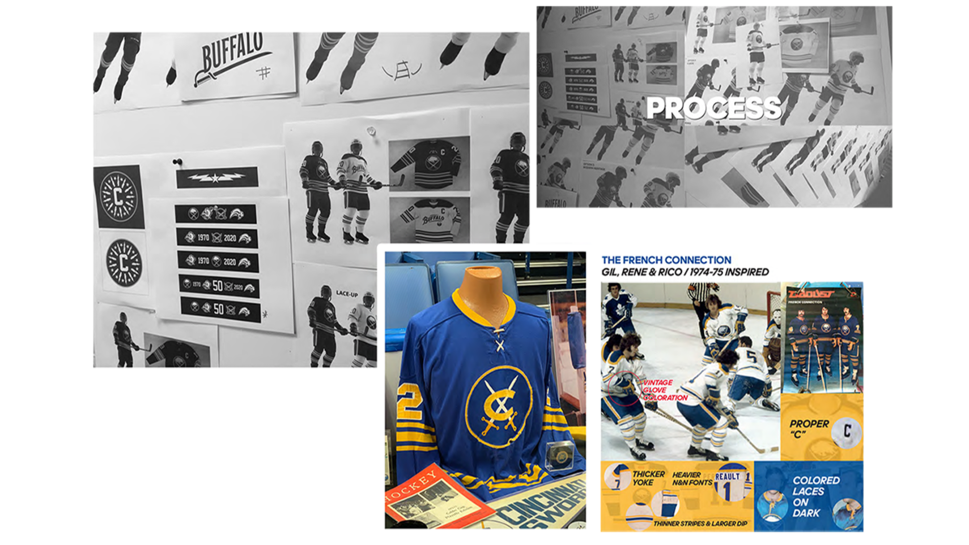
Crest & Main Logo:
The crest has been slightly simplified from the original Sabres uniforms, with silver accents removed to create a sleek modern appeal. Also, details first seen in the 50th season jersey crest have been carried over to this uniform system, most notably the stitching pattern in the buffalo.
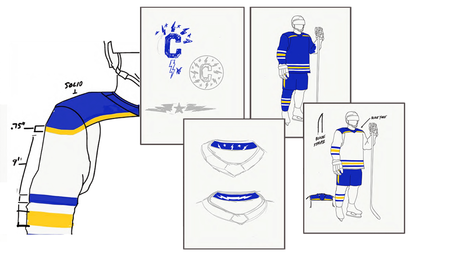
Neck Detail:
The inner neck collar is our way of paying homage to our hometown, touching upon the City of Buffalo's official crest. This team enjoys an unparalleled bond with the community at large, so it felt appropriate to honor that within the jersey itself.
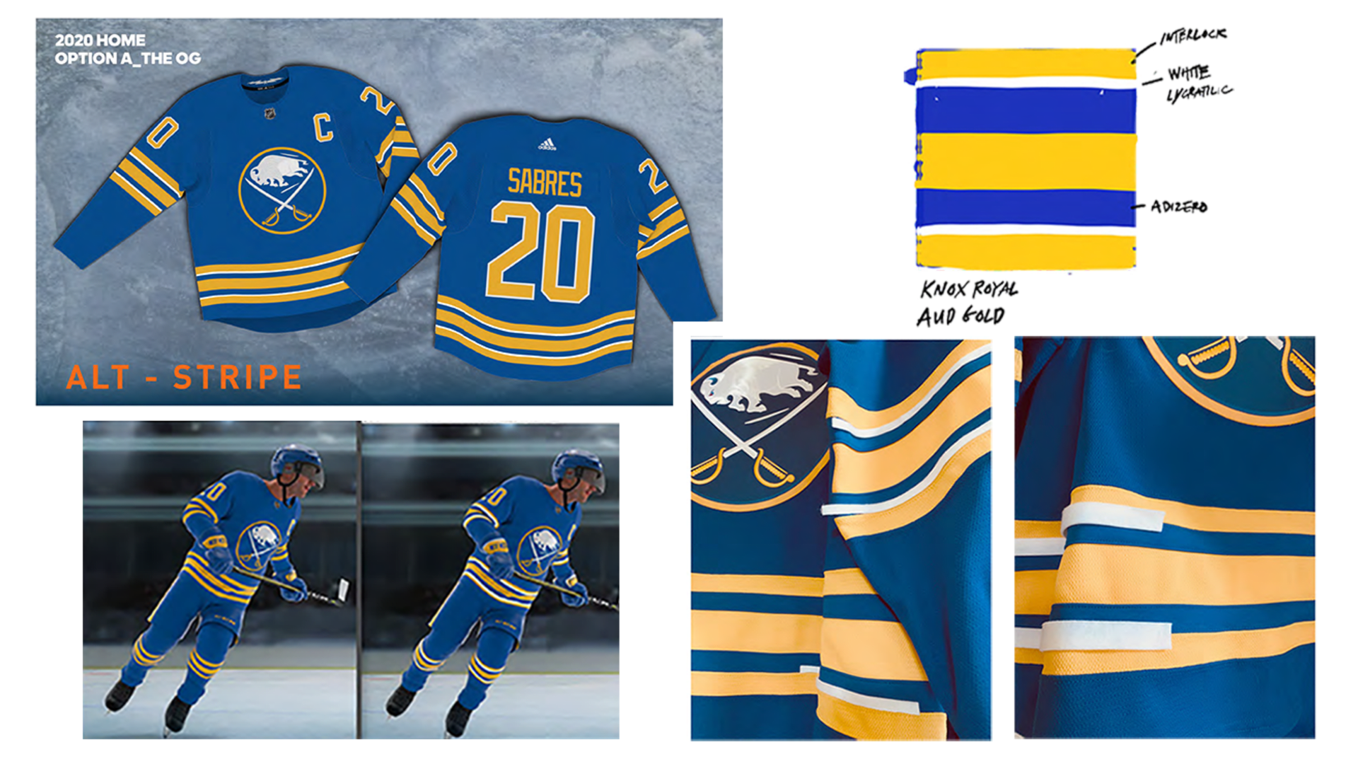
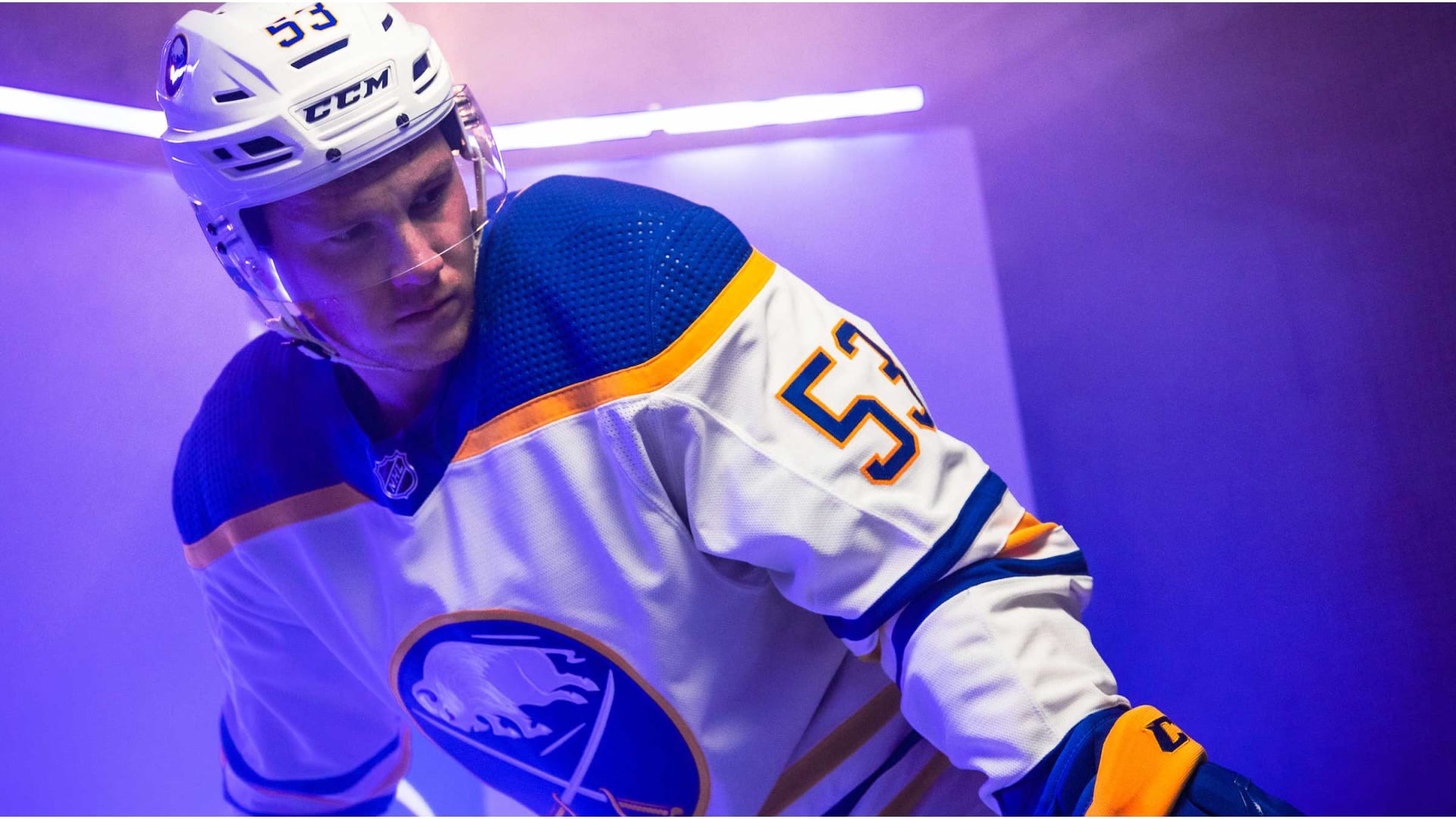
Striping:
We wanted to pay tribute to the striping patterns of the past but also introduce some nuanced detail. We layered some simple white piping on top of the gold stripes to accomplish this. In conjunction with Adidas, we also developed the white uniform shoulder striping.
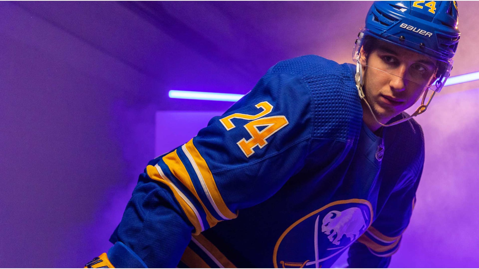
Design Goals:
Our goal throughout this process has been to create a timeless uniform system that respects team heritage and looks boldly towards the future as well. Returning to our beloved royal blue was just the start - we wanted to create something truly unique. To do that, we needed to identify key elements that harken back to what's made this franchise so special through the years.