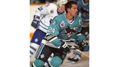
SJS_Smith_25thAnniversary_Douglas

William Douglas has been writing The Color of Hockey blog for the past eight years. Douglas joined NHL.com in March 2019 and writes about people of color in the game. Today, he profiles Terry Smith, a Northern California artist who created the original logo for the San Jose Sharks.

Terry Smith loves seeing the expression on some people's faces when they learn that he's responsible for one of hockey's most iconic and successful logos.
"Nobody knows who I am or what I look like," said Smith, a Northern California-based artist and former Stanford University basketball player. "Every now and then the San Jose Sharks might do something, and I'll speak somewhere and there's usually a little bit of a look of surprise, which I find amusing."
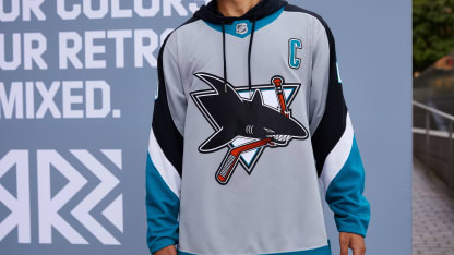
Smith created the Sharks logo that adorned the teal jerseys and quickly became a sports merchandising sensation when the NHL's 22nd team debuted in 1991-92. The original logo is making a comeback on the Sharks' Reverse Retro jersey, one of the 31 retro alternate jerseys that NHL teams will wear this season.
"It's taking me back 30 years and it just makes me feel old," the 60-year-old artist said of the Reverse Retro jersey. "As an artist, you love to do things that people get excited about whether it's a painting or logo, whatever you might be doing. It's nice when people like it."

SJS_posed_retro_jersey

Thirty years ago, that three-dimensional image of a fierce (but not too fierce) hockey stick-chomping shark jutting out from a triangle helped the Sharks achieve success at the cash register before they experienced it on the ice. The Sharks had the NHL's worst record (17-58 and five ties) in 1991-92 but finished second behind the NBA champion Chicago Bulls in team merchandise sales and remained a top seller for several seasons.
San Jose's look became so popular that The Hockey News ranked the 1991-92 Sharks jersey first on its list of the Top 100 Jerseys of All Time in 2015 and described Smith's logo as "perfect."
"San Jose may not have popularized the use of a triangle as background, but the way the shark is springing out if fantastic," Ryan Kennedy of The Hockey News wrote. "The teal blue is definitely bold, and San Jose owns that color."
That was high praise considering that many hockey aficionados initially weren't particularly fond of the jersey, Smith said.
"Traditional hockey people definitely didn't like it at the beginning," said Smith, president of Terry Smith Creations. "The people outside of hockey liked it and, over time, the hockey folks got on board. But it wasn't getting glowing reviews."
The jersey "broke a lot of rules," Smith said, the main offenses being the teal color scheme and the shark munching on a hockey stick.
"We were taking the tool of their trade, a la the stick, and we were breaking it in half," he said. "Fortunately, the team allowed me to do something different and were willing to take a chance."
Sharks players loved the look.
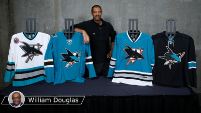
SJS_Wilson_teal

"We thought it was extremely cool and creative," said Sharks general manager
Doug Wilson
, who was the team's first captain. "It captured the spirit of something new and it seemed like everywhere you looked, there it was along with the color teal. That was a moment in time for our franchise and the sport of hockey."
The moment was made possible by Matt Levine, who was the Sharks executive vice president for marketing and broadcasting from 1990 to 2000. Levine was familiar with Smith's work and the signature style that the artist calls "sports fantasy." He tasked Smith and another firm "to start interpreting what sharks might look like."
"Our guidance was that we wanted something that was not just another two-dimensional logo -- the guidance that we gave was to develop a three-dimensional logo," Levine said. "Terry did the best work. [The Sharks] were pleased with it, and the organization continues to be pleased with his work as they have done modifications."
Smith said he didn't know much about hockey when he landed the logo job. He had attended a couple of Los Angeles Kings games and watched a few games on television but he remained primarily "a basketball guy."
"I went to Stanford on a basketball scholarship," he said, "so when it came to the subtleties of hockey and knowing everything, I would not have considered myself a hockey fan at the time."
That proved to be helpful in designing the logo.
"Because I was not a diehard hockey fan, I didn't bring any preconceptions to what I was going to do," Smith said. "It allowed me to bring a different sensibility."

SJS_TerryCurrentDay

The success of the Sharks logo helped make Smith an in-demand artist who has done work for the NBA, Major League Soccer, the NFL, the Arena Football League, several minor league teams, college teams and the entertainment industry.
Now Smith wants to become more involved with the hockey community in hopes of using art and culture as tools to increase diversity and inclusion in all aspects of the sport.
"I think it's important because of what we're looking at, especially in our racial climate today," he said. "If something like the Sharks logo has had that big of an impact on the sport, and it's arguable that maybe it has in some way, people may say, 'Wait a minute, there were contributions made not only on the ice but off the ice by people of color.'
"Not every kid is going to able to grow up and participate on the ice, but that doesn't mean there aren't opportunities within teams, within organizations, other things that they can be involved in professional sports."