RELATED: [Vote now: #NHLGreatestUniforms | Top 10 leaderboard]
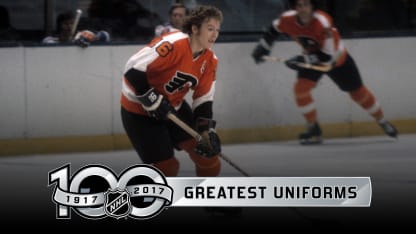
Let's face it. The Philadelphia Flyers jersey has stood the test of time like no other because when you see it, the memories of the Broad Street Bullies always take you back to the early days in Philadelphia when the Spectrum was considered one of the toughest buildings in which to play.
In addition to the logo being one of the most intimidating in League history, I've always admired the simple design which was reflective of the nickname and the city. The winged P is an iconic emblem and I've always loved the backstory behind it.
The artist, Sam Ciccone, drew four wings on a stylized P to make it fly and an orange dot inside the P to represent a hockey puck. It offers all the elements that a hockey logo should have and always gave me the impression of speed and intensity -- the identity of the Flyers during that era.
The Flyers wore this design during their back-to-back Stanley Cup wins in 1974 and 1975, and the logo hasn't changed despite two very minimal upgrades to the stripes on the jersey in 1981-82 and from 1982-2010. I own a
Bobby Clarke
, and Andre "Moose" Dupont jersey from this era. Both classics.
